
CLIENT
Aguirre
_Visual identity
PROJECT
Restaurant with a San Sebastian's soul, where great food and fine drinks come together to shape its identity. Vintage imagery combined with contemporary compositions creates a visual system that blends tradition with a modern touch.
The challenge was to create a visual identity inspired by San Sebastián in which gastronomy, celebration, and after work culture coexist. A brand that is fun yet clearly focused on great food.
We developed the concept "Good food. Good drinks. Good living." ("El buen comer. El buen beber. El buen vivir.") to communicate this idea in a unified and direct way, encapsulating everything in a single message.
The result is an identity built around blue, strongly linked to Donostia and the sea, contrasted with a bold red for intensity and a gold accent as a supporting element.
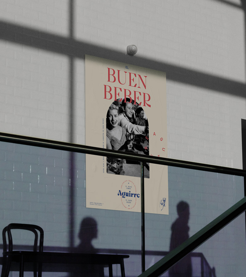


The typographic system consists of two fonts, both having a key role in the brand and representing the fusion of tradition and modernity. One is a sharp-edged serif typeface that adds strong character, while the other is a monospaced font that brings flexibility to compositions, making creative use of negative space.


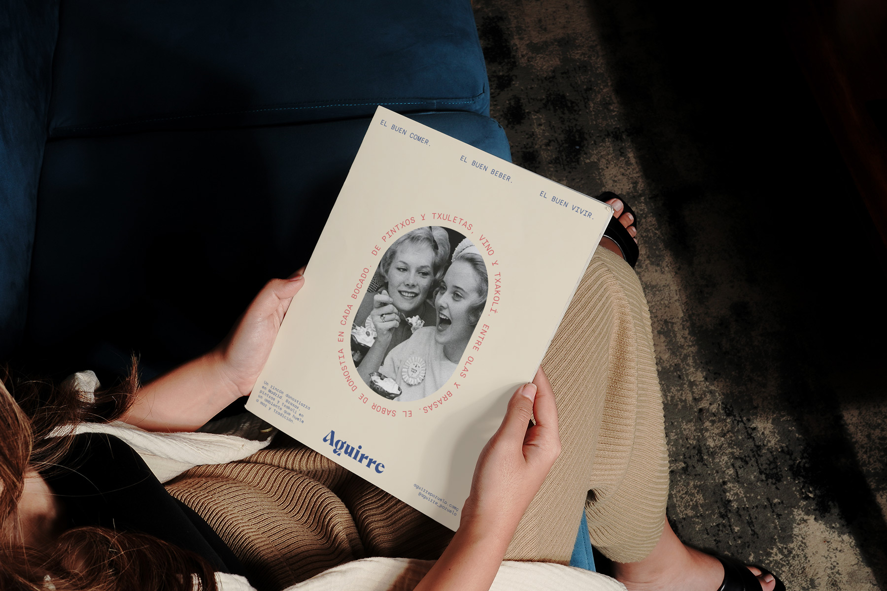
The brand relies on black-and-white images from the 1920s, always depicting festive settings centered around food and drink. This photographic style enhances brand recognition and differentiation and reinforces its celebratory spirit through a classic and nostalgic visual universe.


