CLIENT
La Condesa
_Visual identity
PROJECT
Revolutionary aristocracy—the concept that inspires La Condesa’s visual system, blending punk attitude with royal elegance.
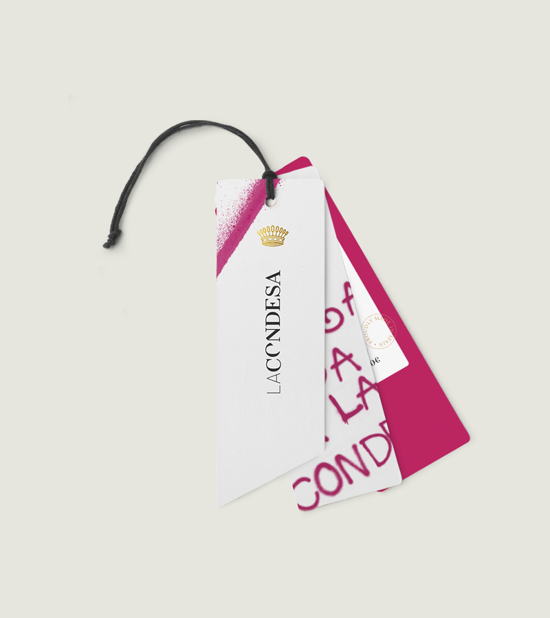
La Condesa is a Spanish brand best known for its military-style jackets. We redesigned the brand to amplify the contrast between the two elements that inspired its founder: aristocracy and Rock & Roll.
We developed the concept of "revolutionary aristocracy" to shape an identity rooted in minimalism and elegance, later disrupted by graphic elements reminiscent of the punk aesthetic.
The crown serves as the brand’s icon symbolically defaced with a magenta spray—La Condesa’s signature color.

The logo is built on a serif typeface that subtly incorporates a nod to the guillotine within its design, embodying the brand’s core concepts—revolution and defiance.


The spray is a key element of the brand, serving as a symbol of disruption. It also inspires a handcrafted typeface that reinforces this purpose—creating noise and chaos.