
CLIENT
Zancada Camps
_Brand strategy
_Visual identity
_Web design
PROJECT
A visual identity inspired by creativity, fun, authenticity, and spontaneity. That’s Zancada. Let’s have some fun.
Zancada specializes in creating and organizing summer camp activities built around highly creative dynamics designed not only to entertain but also to educate campers.
A "zancada" is a long stride that requires determination and energy, but in return, helps you reach farther. It evokes physical activity while also symbolizing a step in personal growth. These meanings became the foundation of the new brand, starting with the naming—choosing a word that is easy to remember and evokes positive feelings. Additionally, we incorporated this stride into the brand's icon as a subtle nod and a memorable visual element.


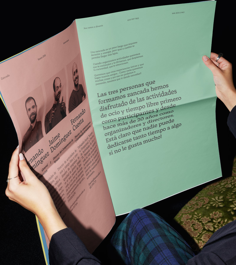


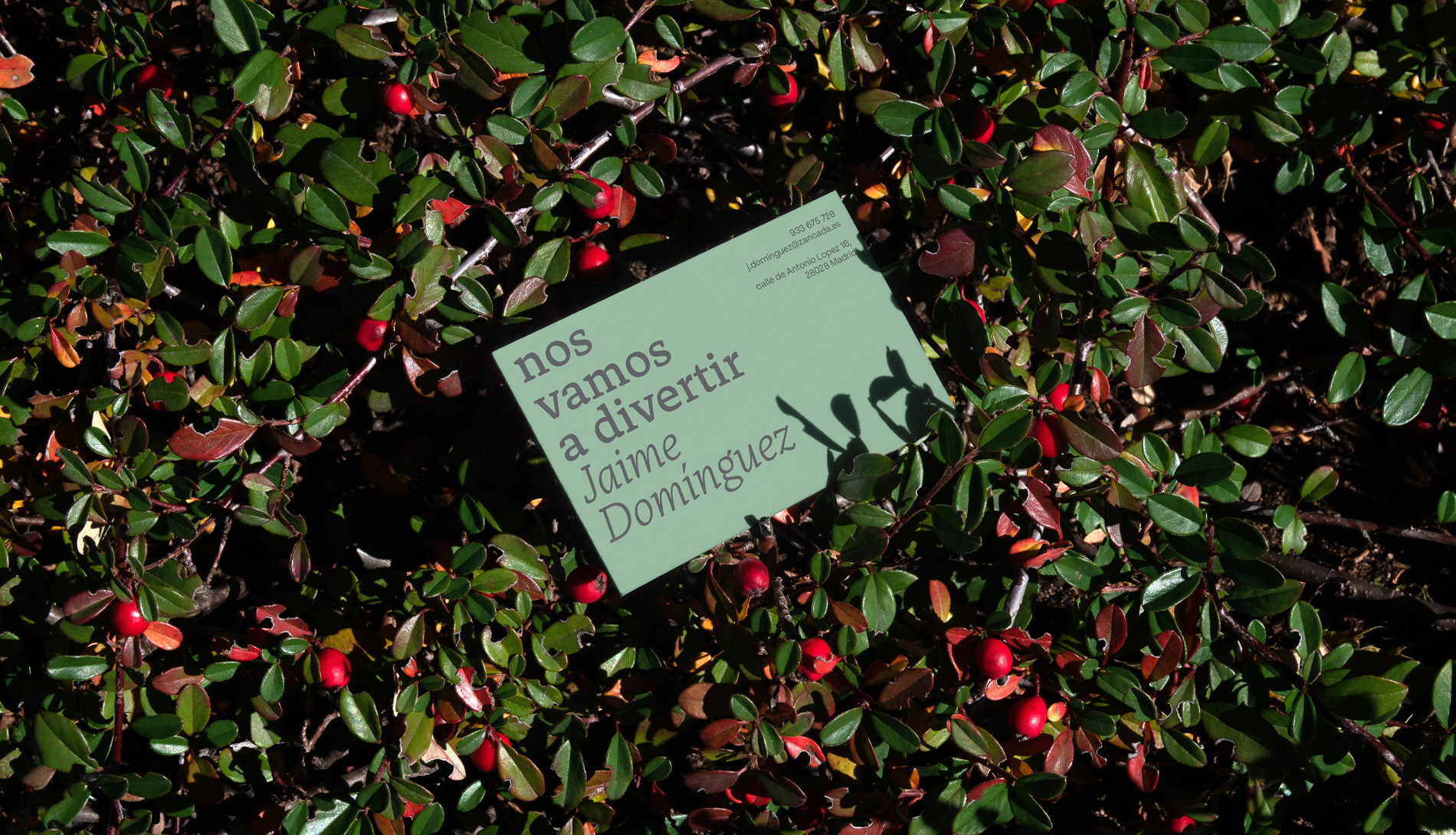


The visual identity is built on a multi-tone system with colors that embody creativity and vitality while staying connected to nature. To achieve this, we selected desaturated tones that resemble those found in natural environments.
A bold, characterful typeface was chosen as a key element throughout the identity, emphasizing the brand’s focus on messaging over imagery. The brand’s verbal identity reflects the camp’s personality—imaginative, authentic, and rich in irony—capturing the humor that is essential both to the camp experience and the brand itself.


